- Mar 26, 2024
COLORING EMOTION
- Mark Holmes
- 0 comments
How Color and Material can express emotionality--or the lack thereof.
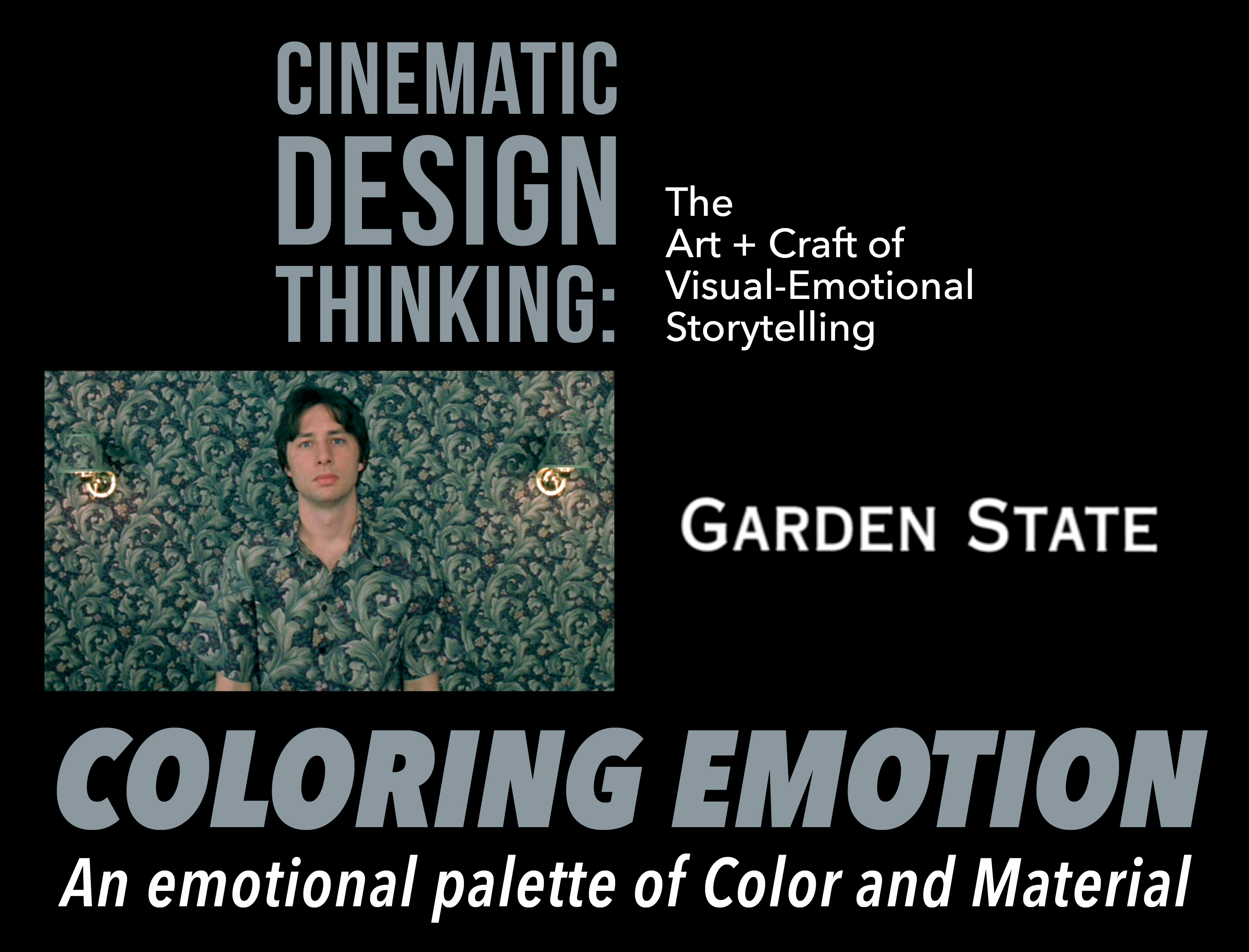
GARDEN STATE is an indie romantic dramedy with a distinctive visual voice and visual design logic that playfully underscores the protagonist's emotional journey from first shot to last. Utilizing a range of design elements from camera, staging, color, to material and movement, design choices orchestrate a charming, artistic expression of human emotionality and growth.
The first 3 shots from the opening scene introduce the protagonist with an overt design language that immediately acclimates the audience to the film’s artful tonality:
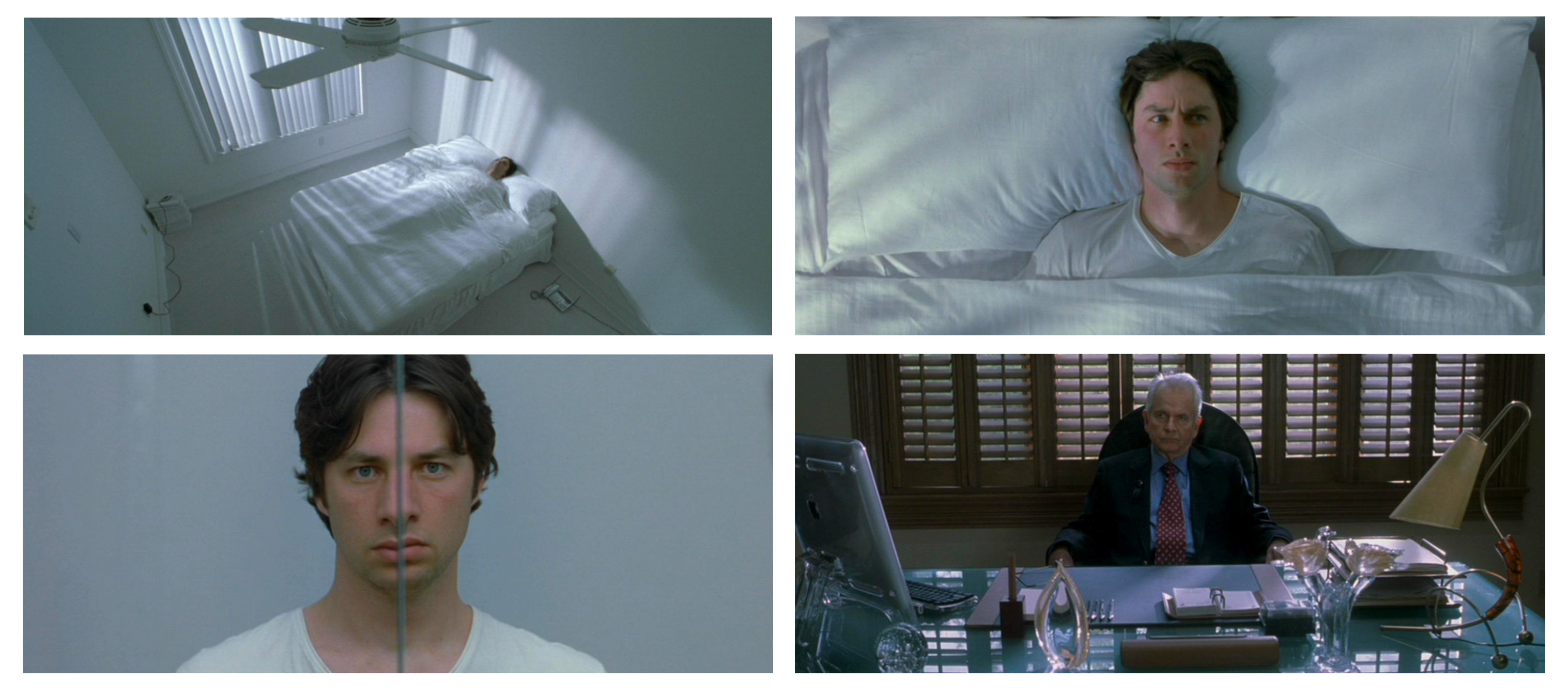
Shot 1: Establishing shot of the protagonist's room. What design choices do you immediately notice? What does the environment say about the character? What can you infer about his life and daily emotional state?
Shot 2: Medium shot of the protagonist in bed. What continuation of visual motif do you immediately pick up? What does the combination of the color design, composition, staging, and posing suggest?
Shot 3: The protagonist stands in front of his bathroom mirror. What obvious choices carry over from the previous shot? What does it suggest about the character’s emotional state or his level of engagement with life?
Shot 4: Later in the film we are introduced to the protagonist’s father, whose character and relationship to the protagonist has a huge impact on the state of the character and his progression. What can you infer from the father based on his office environment? What do you notice about materials, colors, arrangement of objects, composition and posing?
The rest of the film carries the protagonist along a lyrical life journey of mystery, discovery, and awakening. The audience is swept along the ride with thoughtful visuals that range from theatrical and surreal to subtle and sublime.