- Mar 26, 2024
LIFE AS A GRAPE
- Mark Holmes
- 0 comments
How simple color progression can demonstrate character growth and theme.
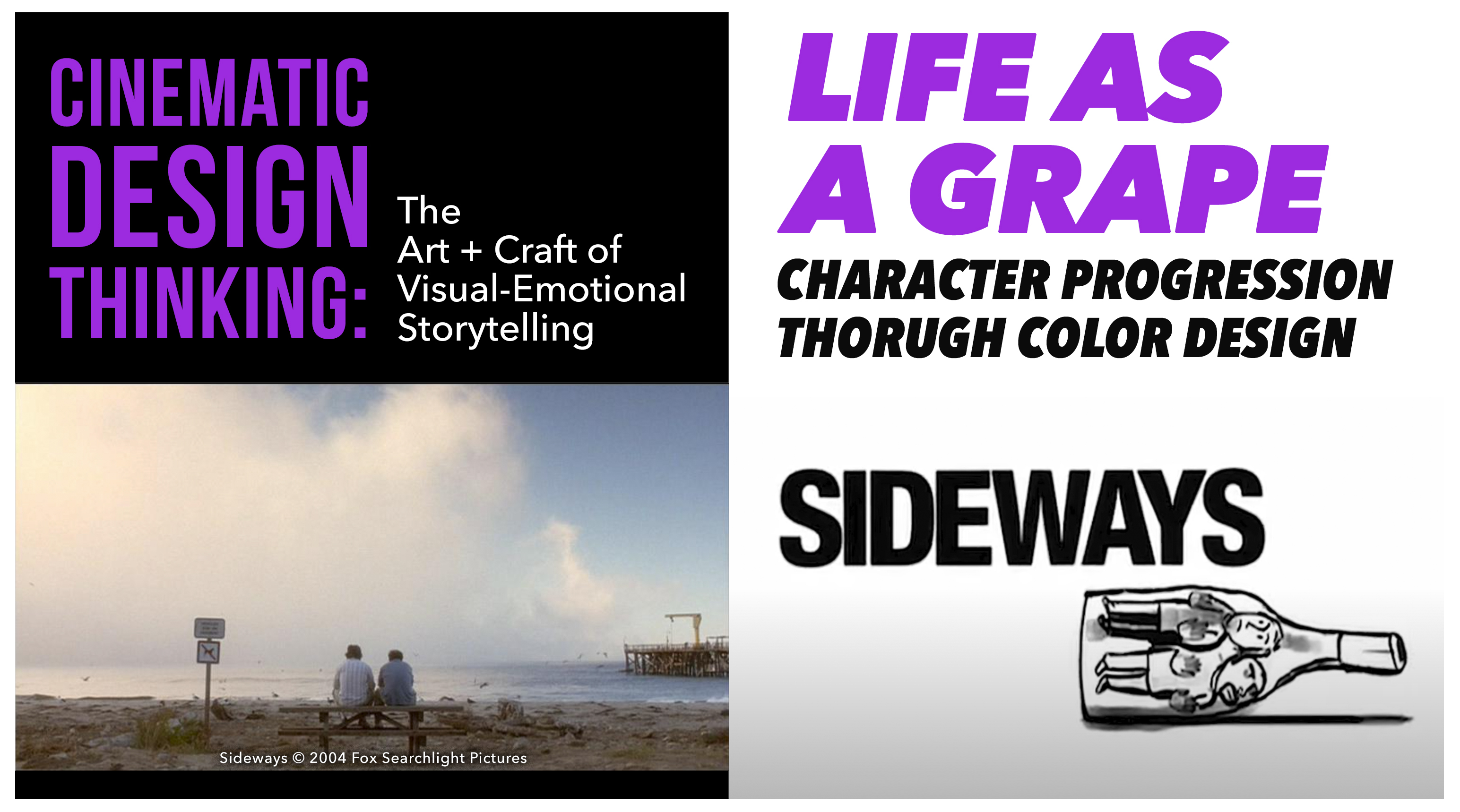
SIDEWAYS is a delightful character study of personal growth in the context of a complexly codependent relationship. The protagonist's dramatic progression is framed in stark contrast to his polar opposite of a friend, where initial assumptions about each of them are gradually subverted to reveal more depth and nuance of character.
The visual design logic of the film is expressed through color associations, visual motifs, contrasts, and a visual progression that meaningfully underscores theme and character development.
Across this series of images, what do you notice about the colors associated with these two characters as they progress across the film? What does the color change suggest about their individual changes and that of their relationship? What do the color choices remind you of?
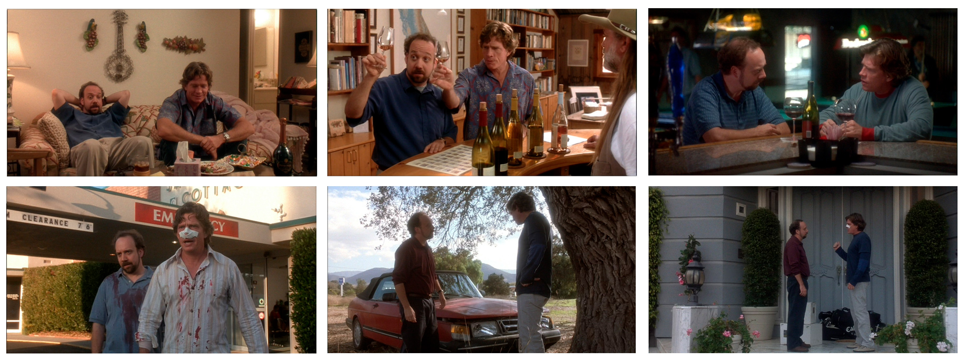
Odds are you may not have noticed this detail on first viewing, but upon reflection the color choices seem blatantly obvious as how they relate to the protagonist's character development to the film's central metaphoric theme.
Sideways is a great example of how cinematic design choices sub-textually supporting narrative intent to enhance audience engagement.